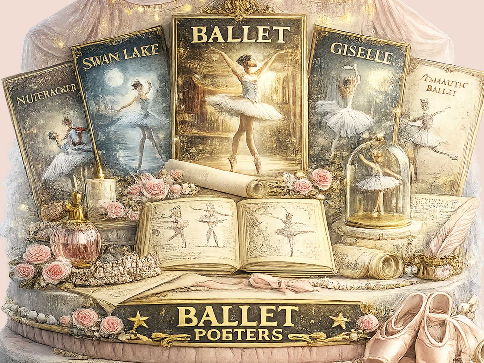
This image settles into the room like a memory reinvented: a London-inflected ballet scene rendered with a softened palette, muted contrast and print-like texture that suggests the same quiet focus as an old studio photograph. The heritage tone is not an affectation but a visual decision — colours gently faded toward warm neutrals, edges relaxed as if handled by decades of light, and typography that nods to retro playbills without pretending to be an artifact. Together these elements make the photograph feel like part of a collected life rather than one more trend-led buy.
What gives the poster its particular sense of patrimony is restraint. The composition avoids glossy spectacle; instead it privileges posture, line and the suggestive grain of paper. That restrained approach changes how you read the image: the dancer’s pose becomes an invitation to recall training rooms, late rehearsals and quiet applause. The vintage-inspired treatment calms visual noise and amplifies the emotional core — the disciplined beauty of ballet — so the picture rewards repeated looking with discoveries small and personal, a fold of a skirt, the suggestion of stage light on an old theater wall.
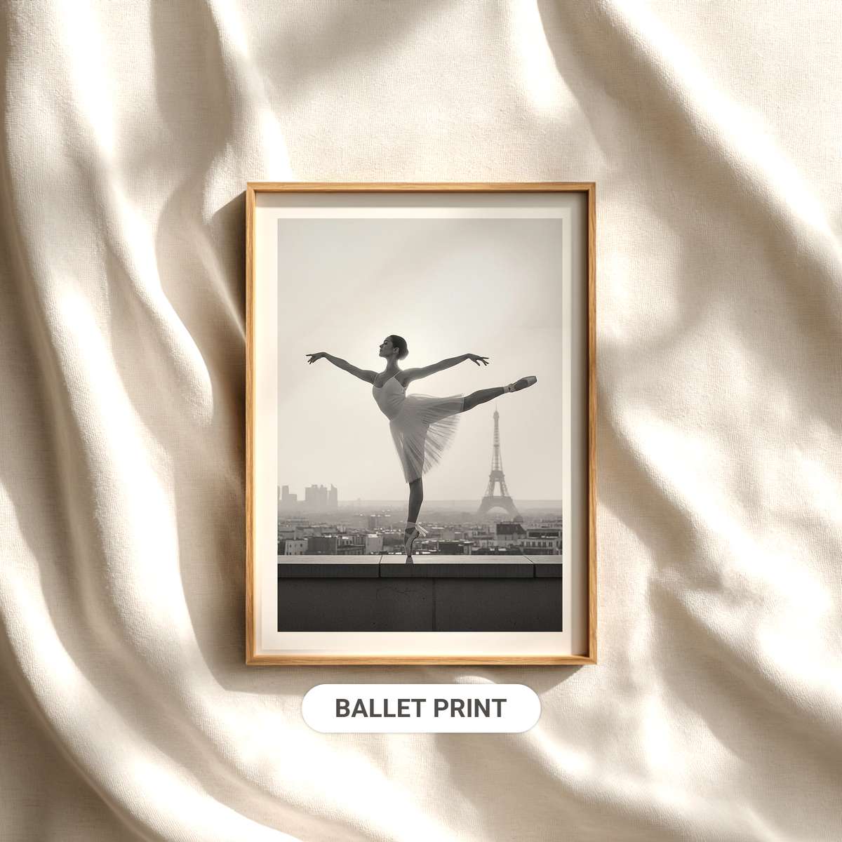
A ballet image with a sense of memory
Softened tones and a slightly weathered finish act like the margins of a memory. Rather than shouting novelty, the poster offers continuity: a sense that ballet is a continuing conversation between past and present. This is helpful for anyone who loves dance not just as spectacle but as a lineage — teachers, repertory, city stages and the practical poetry of studios. These cues create warmth because they mimic the tactile pleasures of printed matter: the ink that sits into paper, the tiny flecks where halftone meets shadow, the way a page in an old program softens at the touch.
[IMAGE_INSERT_ARTICLE_01]
Why vintage texture changes the mood
Visual texture matters because it alters emotional temperature. A glossy fashion shot can feel brisk and disposable; by contrast, a print with archival softness reads as intimate and bookish. The texture suggests time spent with the image rather than a momentary glance. In interiors that value quiet sophistication — a reading corner lined with ballet biographies, a bedroom softened by linen, a living room where light gathers on wooden floors — this poster acts like an acquired piece of decor. It complements rooms that prize material presence and visual continuity rather than competing for attention.
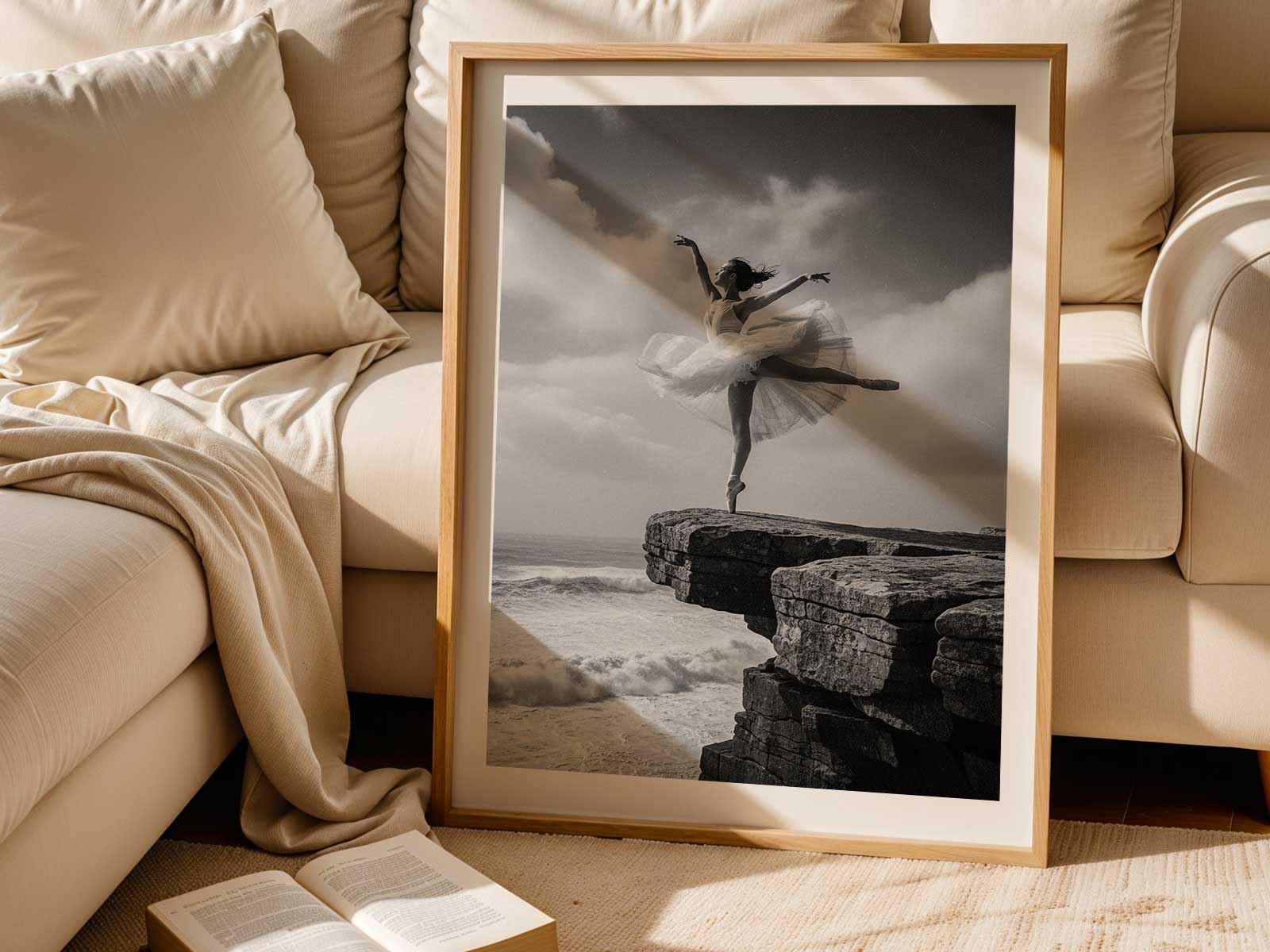
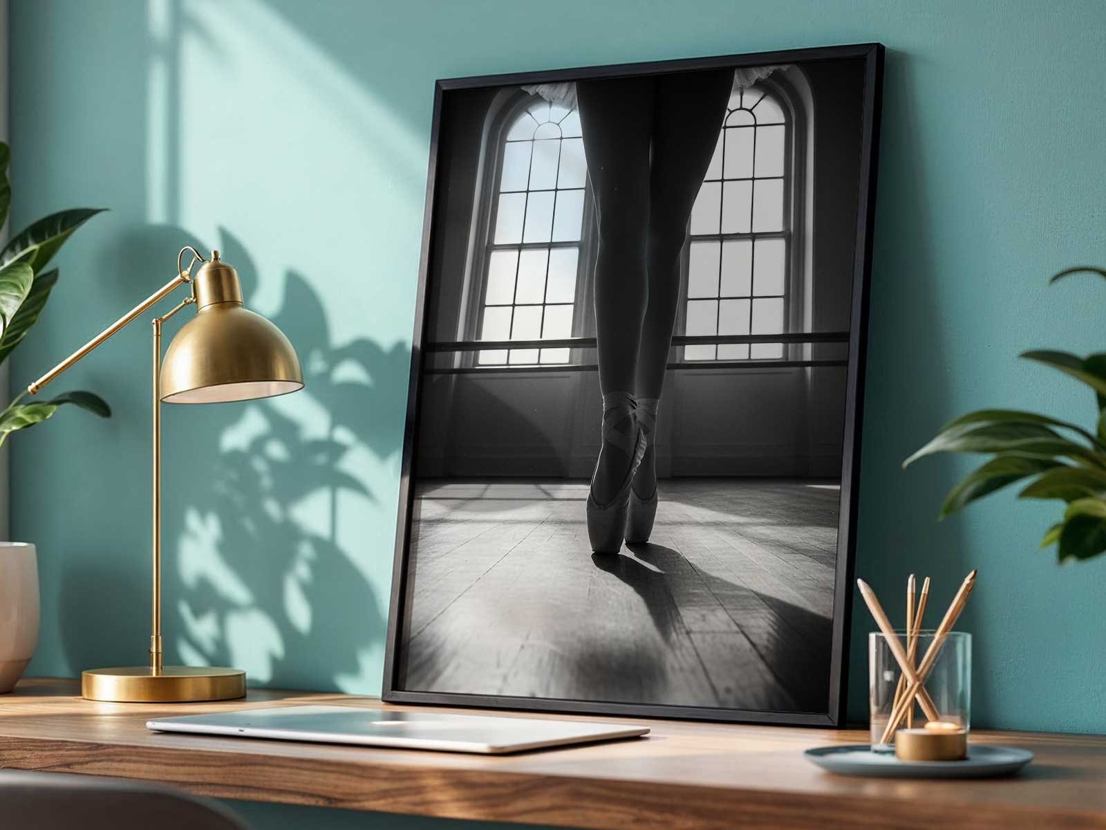
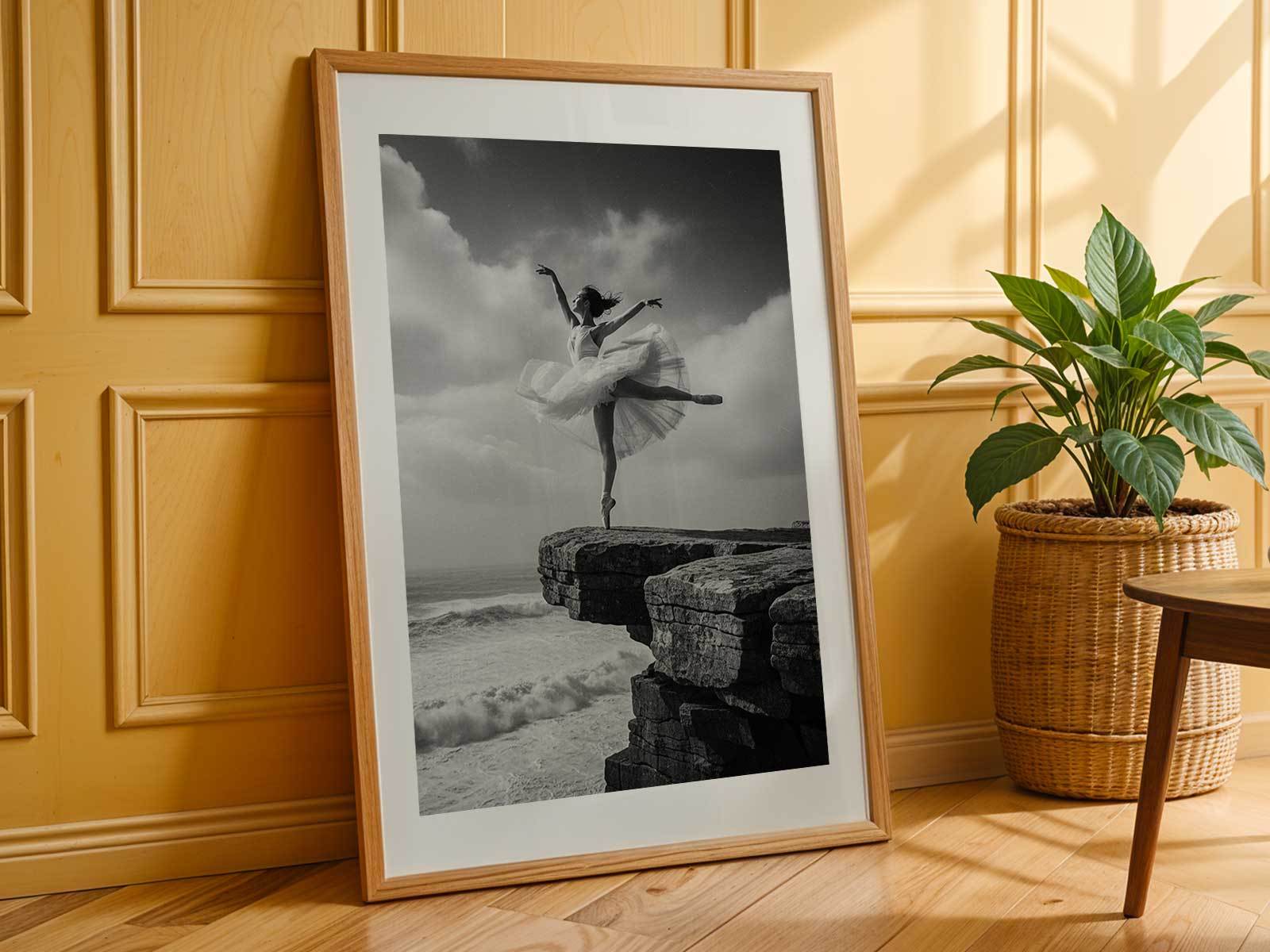
The poster’s appeal is practical as well as poetic. Its palette and restraint make it easy to layer: framed in oak or a warm metal, grouped with study prints or hung alone to set a mood. It doesn’t demand dominance; it suggests depth. For lovers of ballet, print culture, and refined wall art, the piece offers a daily reminder of discipline and warmth — a visual companion that ages gracefully in feeling, if not in actual decades.
In short, this is a ballet dance photography poster designed to feel lived with. It trades momentary trendiness for a rooted visual language: heritage-led colour, print-like softness and a cultivated reserve that gives the image weight. The result is a poster that feels like a page from a private history — intimate, enduring, and quietly resonant in any room that values memory and refined atmosphere.