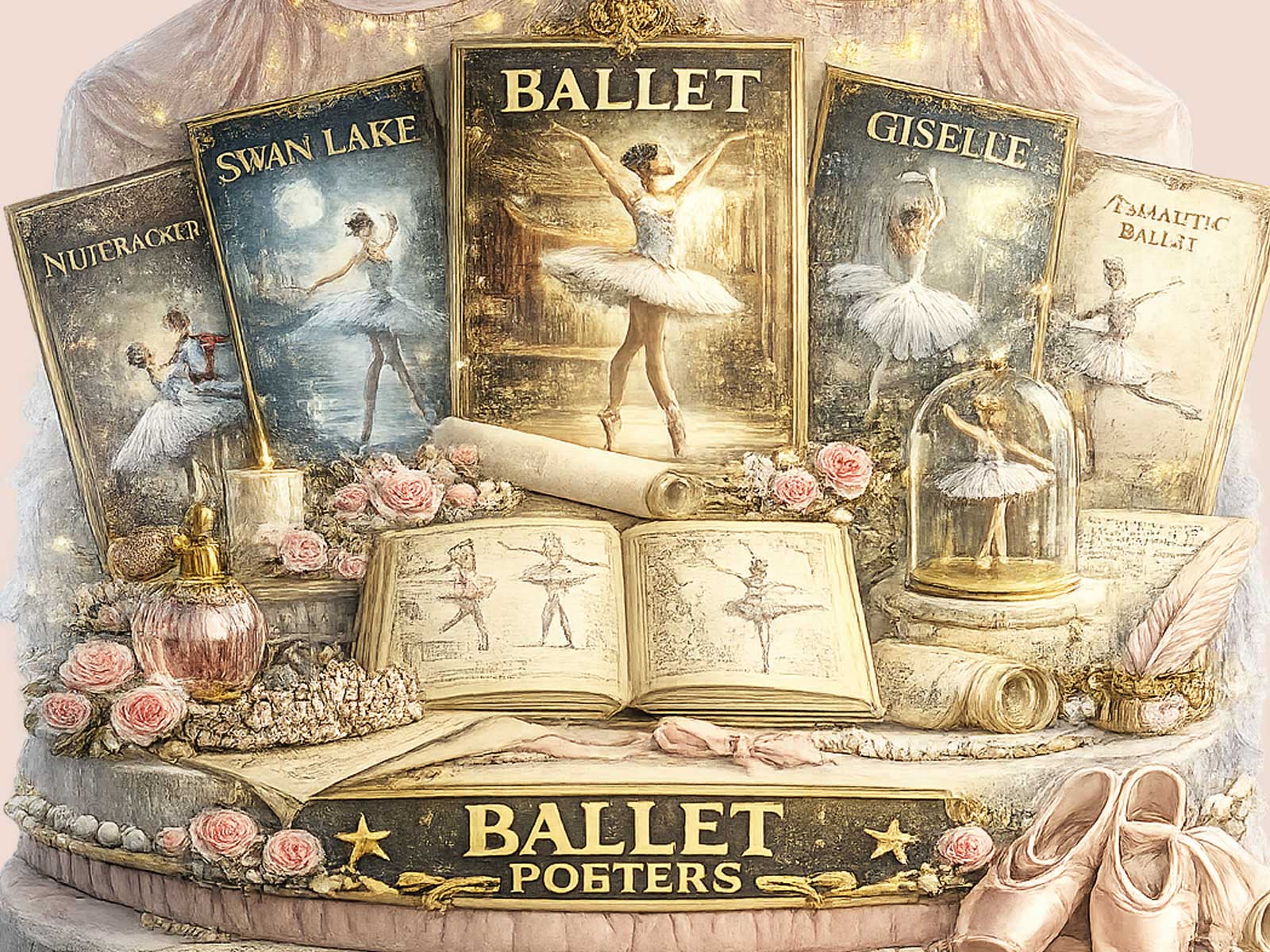
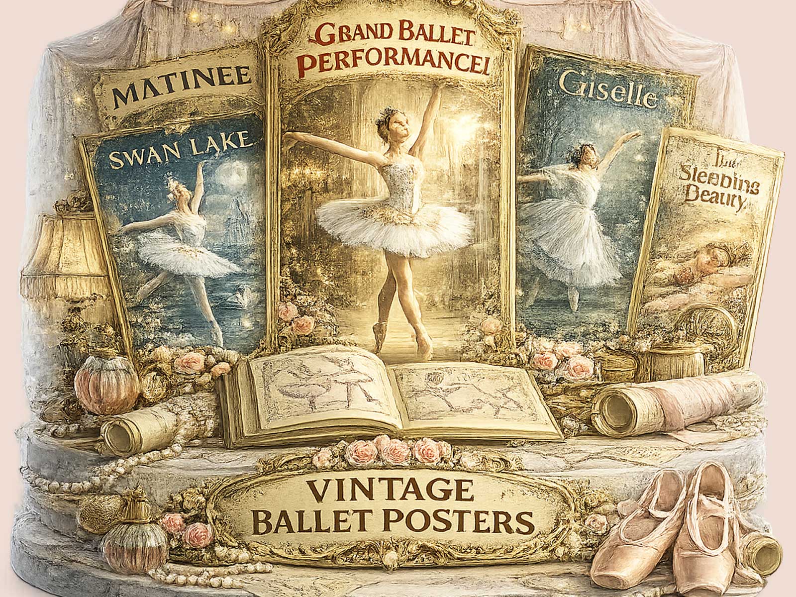
The first impression is tonal: a muted, aged palette and a graphic restraint that reads less like a fashion image and more like a page torn from a well-handled programme. This ballet art photography poster channels a Moscow-inflected atmosphere — not by claiming provenance, but by adopting the compositional rigour, measured light, and archival softness associated with classical stage traditions. The result is an image that feels structured yet intimate, like a moment of rehearsal preserved in paper and pigment.
A ballet image with a sense of memory
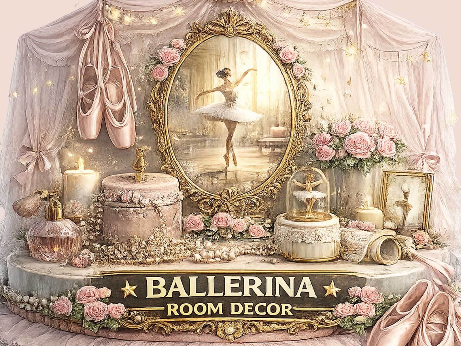
Here the mood is built from specifics: softened contrast that calms the figure against its background, a palette of warm neutrals and chalky umbers that suggest faded stage curtains, and typographic details that echo mid-century programme printing. These cues do the work of memory—they let the viewer supply the rest. You sense footsteps offstage, the echo of applause in a corridor, the patient discipline of classical training. That emotional layering makes the poster feel as if it has been lived with, looked at, and returned to over years.
Printed texture matters. A matte finish and a slight simulated paper grain temper glossy intensity, turning photographic sharpness into a gentler impression. The surface invites touch and close looking: small imperfections in tone become invitations to imagine rehearsal light, costume seams, and the measured geometry of a stage. This tactile suggestion makes the piece more domestic, more suited to rooms that favour books, warm woods, and soft lamps rather than sharp, trend-led colour schemes.
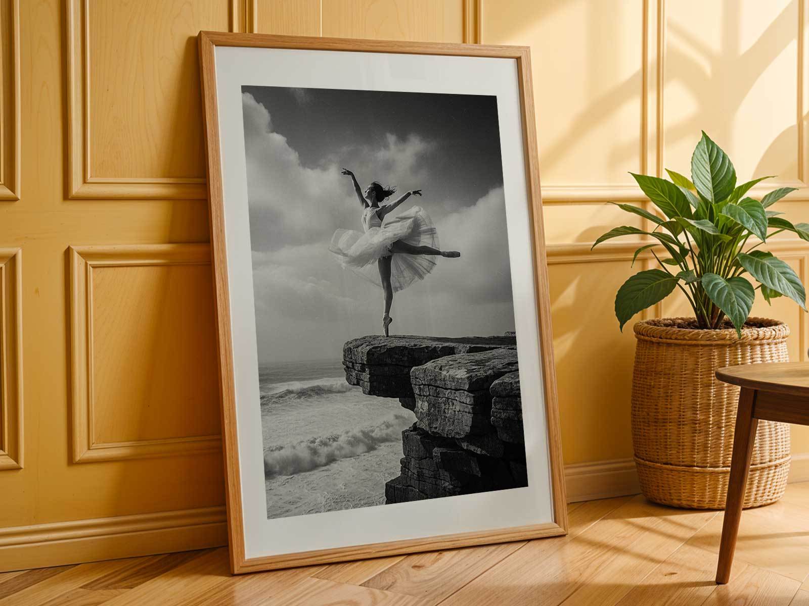
[IMAGE_INSERT_ARTICLE_01]
Why vintage texture changes the mood
Vintage-inspired treatment is not an affectation here but a visual grammar. When highlights are restrained and shadows carry subtle warmth, the dancer’s pose acquires a kind of reserved dignity. The effect is less about dramatizing the body and more about situating it within a continuity of performance: the rehearsed line, the repeatable gesture, the private economy of stagecraft. For lovers of ballet, print culture, and refined décor, that continuity is what transforms an image into a companion on the wall.
This poster resists trend-driven spectacle. It organizes attention through calm composition and inherited visual cues—retro typography, a deliberately softened edge, and a measured color story—so the artwork endures beyond seasonal taste. Rather than shout, it settles into quieter interiors: a music corner where scores are kept, a reading room warmed by filtered light, or a bedroom where the slow rituals of practice and remembering feel at home.
In practical terms, choosing a heritage-led ballet print means choosing atmosphere over novelty. The visual restraint rewards repeated viewing: each look reveals a new fold of shadow, a nuance of texture, a trace of stage memory. It encourages reflection rather than instant gratification, and in that patience lies its long-term appeal.
Author: