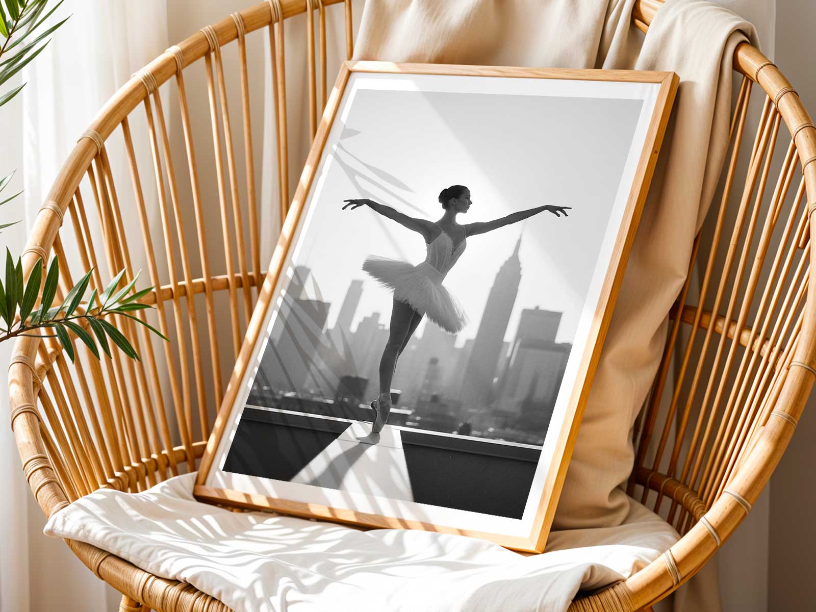
At first glance this ballet photo reads like a found page from a theatre portfolio: an aged palette of sepia-soft neutrals, restrained contrast and the suggestion of Parisian architecture framing a single dancer. The scene trades glossy spectacle for a quieter discipline — composition, posture and material presence — so the image feels as if it has been lived with, not simply displayed. The result is warmth without gimmickry: a picture that invites repeated looking.
A ballet image with a sense of memory
The dancer’s posture carries the weight of rehearsal and recollection rather than posed glamour. Subtle grain and a print-like texture soften edges and turn light into tactile information: a collarbone becomes an archive of movement, a windowed façade suggests the remembered city outside the studio. These vintage-inspired cues transform the photograph from a literal record into a vessel for memory — each viewing suggesting where the dancer has been, what music has lingered and which rehearsed gesture holds emotional charge.
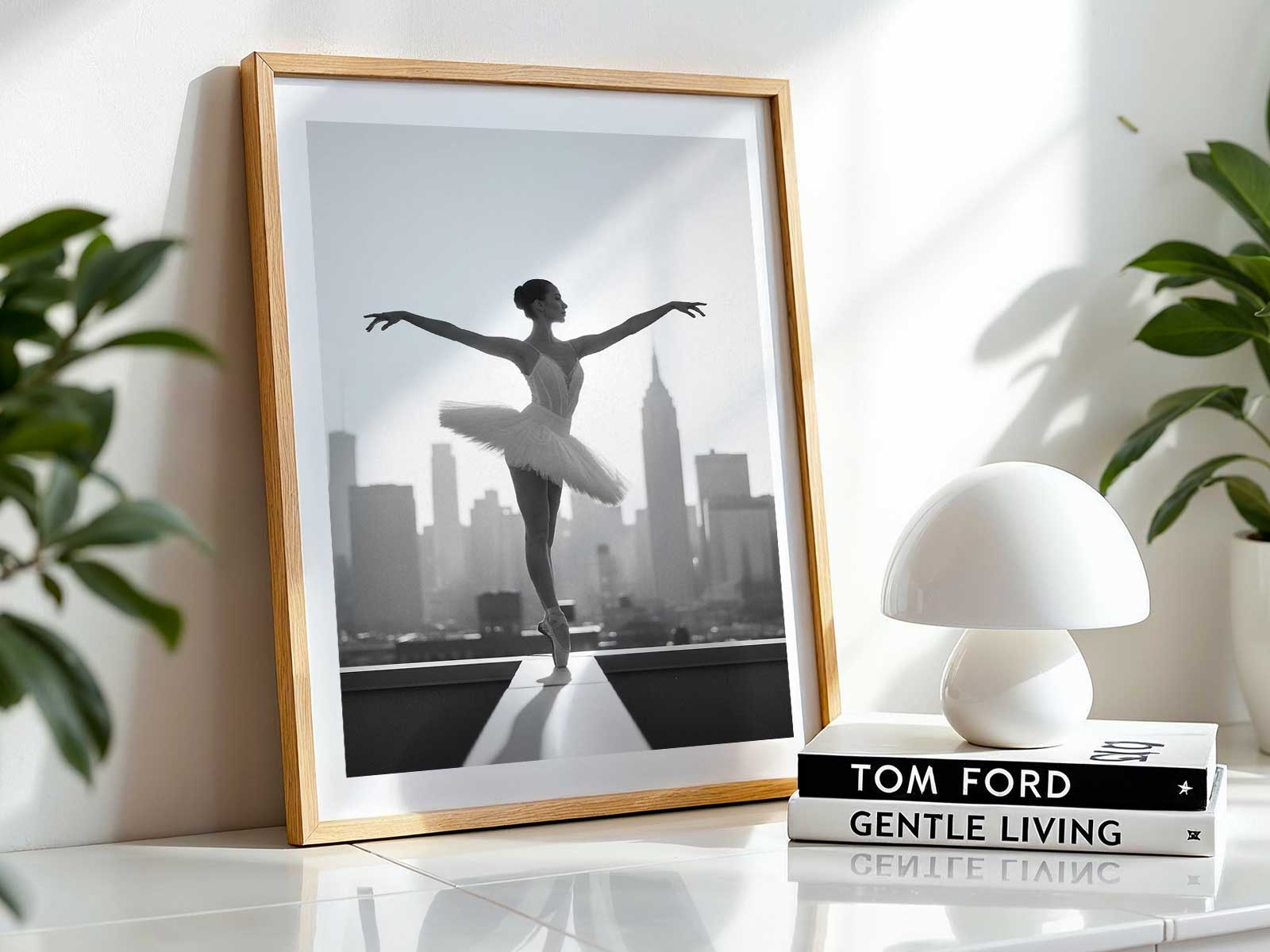
Because the visual language favors restraint, the image resists trend cycles. Its muted tones and careful framing feel considered, like a piece collected over time. This makes the poster especially suited to rooms and corners that value continuity — a reading nook warmed by books, a music alcove where sound and image meet, or a bedroom where quiet mornings and evening reflections are part of the daily ritual.
[IMAGE_INSERT_ARTICLE_01]
Why vintage texture changes the mood
Printed texture and a softened contrast alter how we physically experience the photograph. Instead of the distance of high-gloss imagery, the poster offers close visual intimacy: shadows read as layered surfaces; highlights feel like the worn edges of old paper. That tactile suggestion invites touch and proximity in the mind’s eye, making the dancer’s presence feel domestic and immediate rather than theatrical and removed. It’s an effect that rewards repeat viewing, revealing small compositional details and deepening emotional response over time.
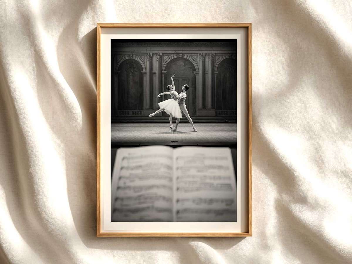
Heritage-led styling also shapes interpretation. Architectural hints — a balustrade, a tall window, a cast-iron stair — give the scene context without anchoring it to a specific date. The restraint in typographic or graphic elements suggests print culture and studio tradition rather than fast-moving fashion. This allows the poster to read as part of a collected interior: an image that complements heirloom objects, musical scores, and the quiet geometry of a well-used room.
Choosing this ballet photo is a choice for presence over noise. It’s a visual decision that privileges atmosphere, material feeling and the domestic life of art. The poster does not shout; it endures. It offers a private archive of movement, a softened cityscape and a dancer whose memory remains with the viewer long after the first look.
Author: