How Paquita’s Embroideries, Iberian Contrasts and White Gala Tunics Frame…
Paquita stages a distinctive visual argument: richly embroidered, Iberian‑inflected costume vocabulary placed in deliberate contrast with moments of classical whiteness. This article examines how those broderies, Spanish‑style corset cues and the recurring ‘white gala’ for the Grand Pas produce a coherent stage identity that frames — rather than overwhelms — the ballet’s virtuosic technique.
Quick answer
Paquita’s visual logic rests on two complementary codes: an Iberian, ornamented character dress that signals locale and dramatic specificity, and a white classical vocabulary for the Grand Pas that isolates and spotlights pure technique.
What this article explains
- How embroidered bodices and Spanish dress create an identifiable cultural frame.
- Why the white gala aesthetic clarifies hierarchy and places virtuosity centre stage.
- How contrast between character costume and classical tutus shapes viewers’ perception of movement and role.
THE FIRST VISUAL WORLD OF THE BALLET
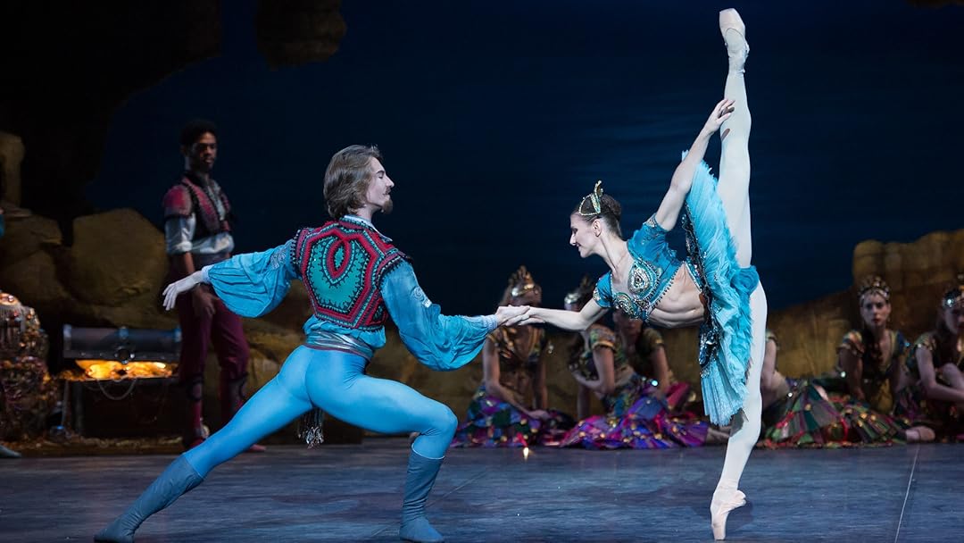
From its earliest visual signals Paquita advertises a Spanishate theatricality. Verified programme and repertory notes point to deliberate references — Alhambra imagery, Iberian colourings and a romanticised Spanish iconography documented since the 19th century — that set the cultural tone before choreography begins. These cues place the audience in a recognizable visual world: dress and ornamentation act as a shorthand for locale and style.
COSTUME SILHOUETTES AND CHARACTER LANGUAGE
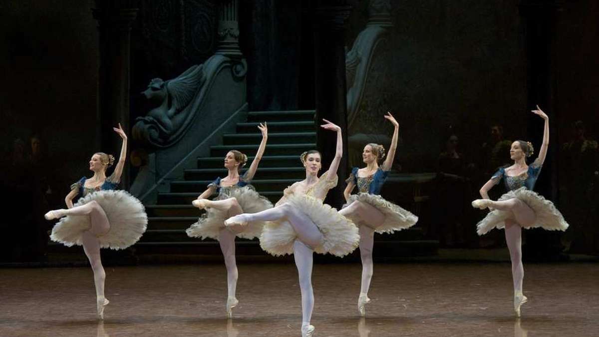
Designers consistently foreground richly decorated bodices, corset‑inspired shaping and fitted character dress as central to Paquita’s look. Those silhouettes do specific dramaturgical work: the structured, ornamented torso creates a compact, expressive upper body whose visual weight locates characters in a folkloric or regional register. By contrast, classical silhouettes used later — notably the short, white tutus — strip away regional specificity and recast the body as an instrument of technique.
COLOUR, TEXTURE, AND ATMOSPHERE
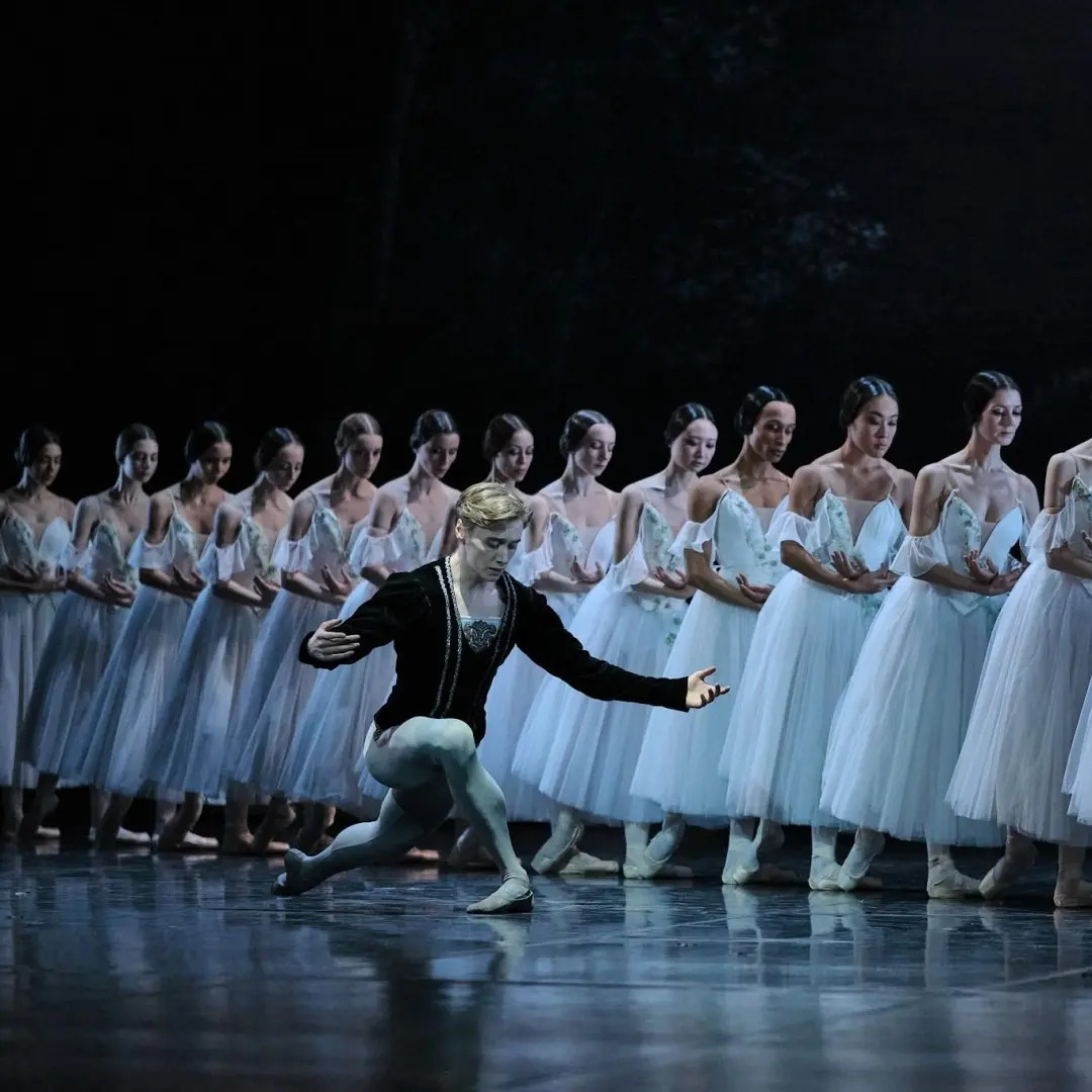
Programme material and modern designer statements describe a twin palette: colourful, embroidered textiles for the Spanish‑flavoured passages and a light, white palette for classical displays. The textured surfaces of broderies and appliqués create visual density onstage; they compress light and attract attention to decorative detail. White tutus, conversely, reflect stage light and read as planes of purity that simplify the visual field, allowing intricate footwork and line to dominate perception.
COSTUME AND MOVEMENT TOGETHER
Because Paquita alternates between character‑based dances and the Grand Pas classique, costume does more than label: it negotiates how movement is seen. Embroidered, layered character costumes visually enrich communal scenes and give texture to group formations. The white gala costume removes that texture, so individual extensions, turns and batterie read with increased clarity. In practical terms, the ornamented bodice defines a torso silhouette that emphasizes épaulement and upper‑body presence; the white tutu privileges leg line and classical outline.
ICONIC IMAGES, SCENES, AND MEMORY
Historical lithographs and continuing design choices show that Paquita’s image has always leaned on a few repeatable pictures: the decorated Spanish heroine within a crowded, colourful setting, and the stark white tableau of the Grand Pas. These two compressed images survive company to company because they condense complex stage action into instantly legible visual moments — one culturally specific and ornamented, the other abstract and technique‑focused. That contrast is what remains mentally sticky: viewers carry away either the costume‑rich snapshot of place or the reduced, classical silhouette that epitomizes virtuosity.
DIFFERENT PRODUCTIONS, DIFFERENT VISUAL READINGS
Verified programme notes and designer portfolios show that recent productions deliberately work these codes rather than inventing new ones. Designers may vary palette intensity, trim or historical reference, but they often retain the twofold opposition between Spanish ornament and white classical dress. This persistence explains why Paquita can be reimagined while still keeping a recognisable visual identity: the balance between decorated character dress and the white Grand Pas serves as a durable structural choice, even when surface details shift.
CLOSING INTERPRETATION
Paquita’s visual identity is not mere ornament; it is a programmatic pairing that stages culture against craft. Broderies and Iberian costume elements anchor the ballet in a textured, place‑specific image, while the white gala functionally isolates classical technique. Together they let costume do what choreographic notation alone cannot: direct the eye, define hierarchy and render virtuosity visible without swallowing it in decoration. That measured contrast is the clearest reason Paquita’s stage images endure.
Author: William L.